


Why Pixel-Perfect Web Design No Longer Works | Beanstalk
Why Flexible Web Design Matters More Than Pixel Perfection
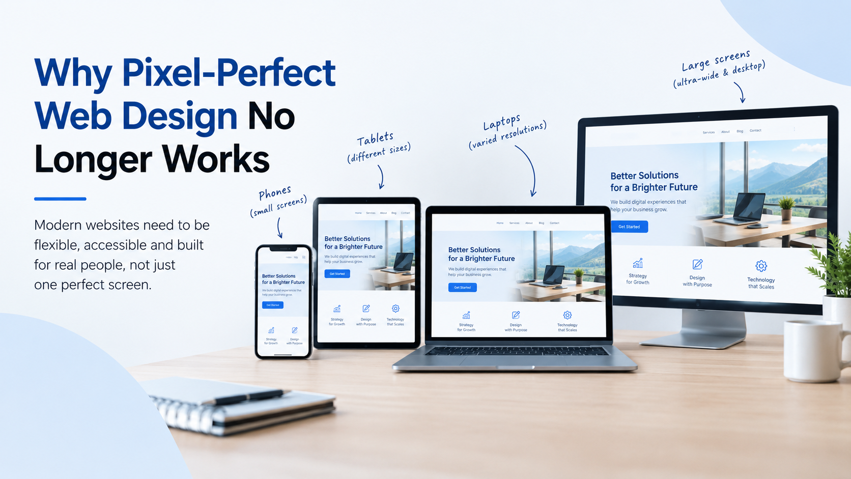
A website can look perfect in a design file and still feel completely different once it goes live. This happens because real users do not all view websites on the same screen, browser, or device.
For years, pixel-perfect web design was treated as the standard. Designers and developers worked to make every spacing value, image size, and layout element match a static design as closely as possible. That approach made sense when websites were built around a limited number of screen sizes. Today, things are different.
Modern websites need to work across smartphones, tablets, laptops, desktops, and even ultra-wide screens. A fixed layout cannot always adapt well to all of them.
Responsive Design Is Built for Real Users
Responsive web design focuses on how a website behaves rather than how it looks on one specific screen.
For example, a three-column layout on a desktop may need to become a single-column layout on a phone. Images may need to resize, buttons may need to move, and text may need to wrap differently. These changes are not design mistakes. They are part of creating a better experience.
A flexible website also handles changing content more effectively. Businesses regularly add new products, services, blog posts, images, and offers. A rigid layout can create problems when content becomes longer or shorter than expected.
Accessibility Matters Too
Users also interact with websites in different ways. Some increase their browser zoom. Others use larger text settings or assistive technologies.
A layout that only works at one exact size can become difficult to use when these settings change. Flexible layouts give content more room to adapt while keeping the website usable.
Think Beyond the Design Mockup
This does not mean visual design is no longer important. Branding, spacing, typography, images, and visual consistency still matter. The difference is that these elements should work within a flexible system.
Instead of asking whether every element matches a design file perfectly, businesses should ask whether the website is easy to use, loads properly, communicates clearly, and guides visitors toward the next step.
A modern website should be designed around people and their behavior, not a single screen size.
If your business is planning a new website or redesign, working with a team that understands both visual design and responsive development can make a big difference. You can explore professional web design services in St. Louis that focus on usability, responsive layouts, and business goals.
Pixel perfection may look impressive in a screenshot, but a website has to do much more than look good in one image. It needs to work wherever your customers find it.

 English
 Arabic
 French
 Portuguese
 Deutsch
 Turkish
 Dutch
 Italiano
 Russian
 Romaian
 Portuguese (Brazil)
 Greek