


How to Compare Physiotherapy Website Template Designs Before Making a Choice
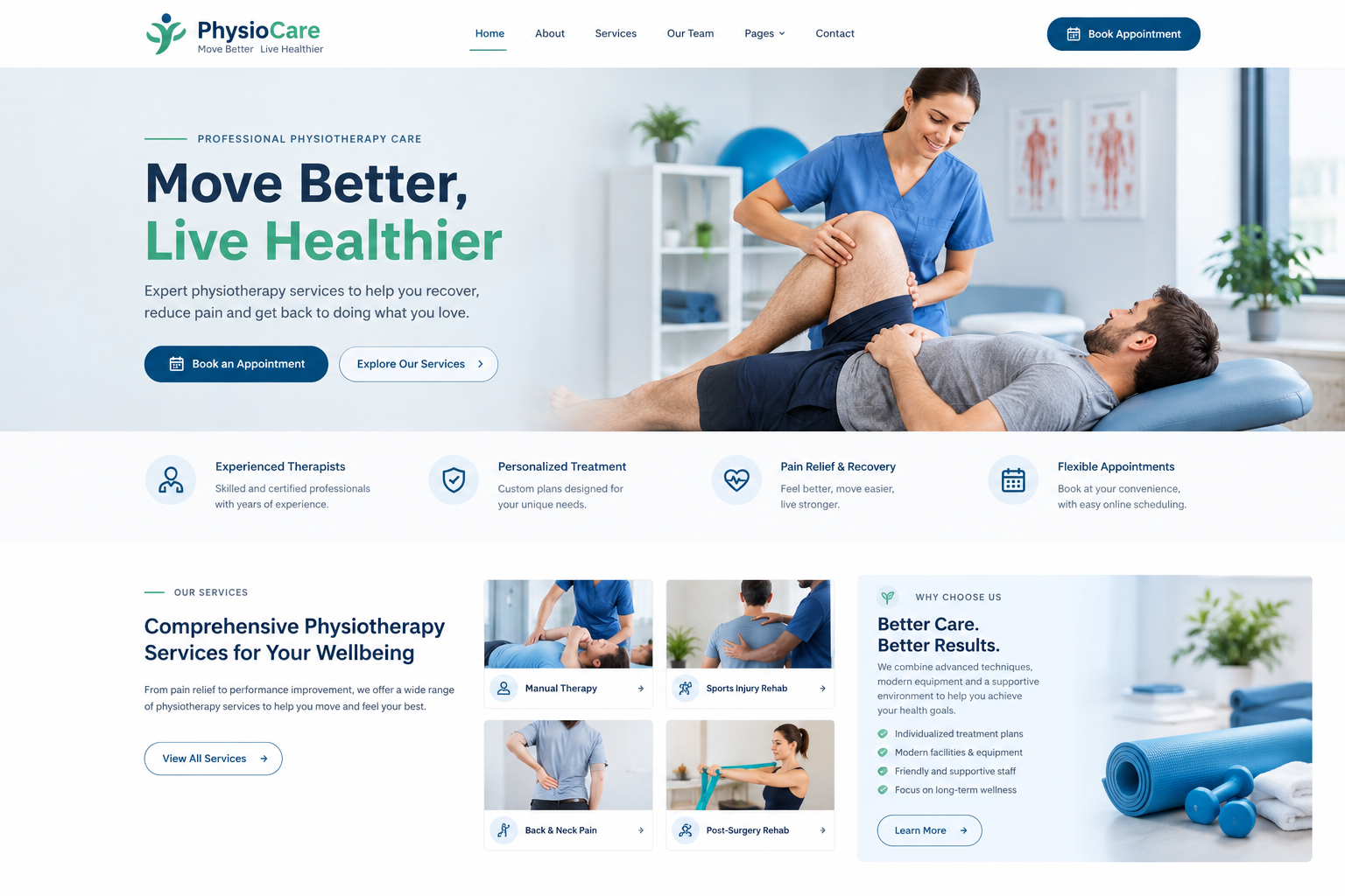
You've narrowed your search down to a few physiotherapy website templates. They all look decent. They all have a nice blue colour scheme, a smiling therapist on the homepage, and a "Book Now" button. Now comes the hard part: deciding which physiotherapy website template is actually best for your clinic.
Comparing designs isn't just about picking the prettiest one. It's about figuring out which will work best for your patients, your team, and your day-to-day routine. Here's a simple way to compare templates side by side without getting overwhelmed.
Set Your Ground Rules First
Decide What Matters Most
Before you compare anything, write down your top priorities. For most clinics, these include easy booking, clear service pages, a good mobile experience and the ability to edit things yourself. Having this list keeps you from being swayed by flashy extras you'll never use.
Know Your Patients
Are most of your patients older adults who like larger text and simple menus? Or younger, active people who browse on their phones? The answer changes what you should look for.
Create a Simple Scorecard
List the Key Points
A scorecard keeps things fair. Make a short table with the templates across the top and your priorities down the side. Score each one from 1 to 5. Typical rows include:
- Booking and contact features
- Service page layouts
- Team and testimonial sections
- Mobile layout
- Loading speed
- Ease of editing
- Support and updates
- Overall look and feel
Be Honest and Consistent
Score each template using the same method. Avoid giving extra points just because you like a colour. You can always change the colours later.
Compare the First Impression
The Homepage Test
Open each demo and look at the homepage for five seconds. Then look away and ask yourself: Do I know what this clinic does? Do I know where to click to book? Does it feel calm and trustworthy? Whichever one communicates best in a few seconds is a strong contender.
Check the Headline Area
A good design gives you space for a clear headline, a short supporting line and a visible button. If the top of the page is crowded or confusing, patients will notice too.
Compare How Easy It Is to Find Things
Menu and Navigation
Is the menu simple? Can you find services, contact details and booking quickly? Try to imagine a patient who's in pain and in a hurry.
Page Layouts Inside
Don't judge only the homepage. Click through the service page, team page, contact page and blog. Make sure the inside pages look just as polished and are just as easy to read.
Compare the Mobile Experience
Use Your Own Phone
Open every demo on your phone, not just a narrowed browser window on your computer. Notice how the menu works, how big the buttons are, and whether the text is comfortable to read.
Look at the Booking Process on Mobile
Try to go from the homepage to booking on a phone. The fewer taps, the better.
Check Page Speed
Load each demo on a mobile connection and compare. Heavy animations and large sliders can slow things down. Faster templates keep patients from giving up.
Read More: 37 Best Healthcare Website Templates for WordPress (Free & Paid)
Compare Design Details That Affect Trust
Photos and Imagery
Does the layout work well with real photos of your clinic and team? Some templates look great only with perfect stock images, then fall flat with ordinary ones. Test by imagining your own photos in each space.
Fonts and Readability
Look at text size, spacing and contrast. Small grey text on a white background is hard to read, especially for older patients.
Colours and Branding
Check whether colours are easy to change to match your logo. A template that fights against your brand colours will feel awkward later.
Compare What You Can Customize
Drag-and-Drop or Code?
Find out whether the template works with a page builder you're comfortable with. If every little change needs code, it'll cost you time or money.
Flexibility to Add Sections
Can you add or remove sections easily? Can you reorder things? You may want to add a new service page or a pricing section later, so flexibility matters.
Pre-Built Demo Pages
Templates with several ready-made page layouts, such as services, team, FAQ and contact, save lots of time.
Compare the Practical Side
Updates and Support
Check when each template was last updated, and how the developer handles support. A beautiful template that no one maintains can cause trouble down the road.
Documentation
Good guides and tutorials make setting up much easier, especially if you're not technical.
Compatibility With Plugins
Make sure the template works well with booking, forms and SEO plugins that you might want to use.
Price and What's Included
Compare cost, but also what you get for it: support period, updates, demo import and licence type. The cheapest option isn't always the best value.
Test With Real Content
Try Your Own Text and Photos
If the template allows, drop in a few of your real services, a real team photo, and your real phone number. Sometimes a design looks wonderful with the demo text but awkward with yours.
Look at Longer Text
Check how the layout handles long service names or longer descriptions. Some designs break when text doesn't match the demo length.
Get a Second Opinion
Show your top two or three choices to someone who isn't involved, such as a friend, a colleague or even a patient, if appropriate. Ask them to find the booking button, the phone number, and a description of one service. Watch where they hesitate. That tells you a lot more than your own opinion can.
Make the Final Decision
Add Up the Scores, Then Trust Your Gut
Look at your scorecard totals. If one template is clearly ahead, great. If it's close, think about which one feels right for your clinic's personality and which one you'd be happiest working with every day.
Remember You Can Adjust Things Later
No template is perfect. As long as the foundation is solid, you can tweak colours, photos and wording as you go.
Conclusion
Comparing website template designs gets much easier when you have a clear process: decide your priorities, build a simple scorecard, test on your phone, check the practical details and ask someone else to try it. It stops you from choosing on looks alone and helps you find a design that truly works for your patients. If you'd like a head start, premium WordPress templates made for physiotherapy clinics usually offer polished designs, ready-made pages, and reliable support, which makes comparing and choosing much simpler.
Frequently Asked Questions
1. How many templates should I compare at once?
Three or four is a good number. Comparing too many can make the decision confusing. Narrow the list based on your main priorities first.
2. What's the best way to compare templates fairly?
Use a simple scorecard with the same criteria for every template, such as booking features, mobile layout, speed, ease of editing, and support. Score each from 1 to 5.
3. Should I judge a template by its homepage alone?
No. Click through the service, team, contact, and blog pages as well. Inside pages matter just as much to patients, and some designs look great on the homepage but weaker elsewhere.
4. How can I test a template's mobile experience?
Open the demo on your own phone and try to find the phone number, read a service page, and reach the booking button. Notice how easy it feels and how fast pages load.
5. Does the price tell me which template is better?
Not always. Look at what's included, such as updates, support, demo import, and extra page layouts. A slightly higher price can be good value if it saves you time and trouble.

 English
 Arabic
 French
 Spanish
 Portuguese
 Deutsch
 Turkish
 Dutch
 Italiano
 Russian
 Romaian
 Portuguese (Brazil)